Email Setup
Desktop
Outlook
Thundebird
Mobile
Iphone
Android
AI Features
AI Suggestion
AI Product Tools
AI Customer Service
AI Positioning
AI Profile & AI Prompt Refine
Global AI Content Generator
AI Service Tools
AI FAQ
AI Handbook
Website Management
Login NEWPAGES Merchant System (NMS)
NMS Switch Language
Dashboard
Manage Products
Manage Service
Manage Photoalbum
Manage News / Promotion
Manage Ratings & Reviews
Manage Google Reviews
Profile Setting
NMS Merchant App
Support
Update Form
Report
NP Merchant Points
NMS Credit
Account Setting
Manage Career
Website Setting
Manage Download
Manage YouTube
Content Generator
Manage Others (Gallery)
Manage Testimonials
SEO Guide
On-page Optimization
e-Commerce (My Sales)
Dashboard
Order Management
Invoice
Shipping
Delivery List
Packaging & Picklist
Self Pick Up Setting
Shipping Setting
No available shipping method
Easyparcel
Lalamove
Tracking.my
Members
Marketing Tools
Voucher
Birthday Campaign
Discount Campaign
Add-on Deals
Mix & Match
Purchase Link
Broadcast Management
Product Sold & Customer Report
Ecommerce Mail Setting
Popup & Social Proof
Checkout Cart Setting
Website Header Setting
Additonal Charges Setting
Notification Setting
e-Commerce Process (Add to Cart Flow)
Plugins
Activate Plugin
Marketplace Synchronization
Tiktok Sync
Shopee Sync
Lazada Sync
Affiliate Marketing & Referral
Membership & Loyalty Program
Checkout & Payment Link
Quotation Pro
Sales Landing Page
Whatsapp Cart & Chat
Product Comparison
Social Media Synchronization
Facebook My Chatbot
Booking System
BusinessTag
Warranty System
E-Invoice Customer Profile
Facebook Live
PDF Encryptor
Background Removal
NEWPAGES Apps Management
CRM System
Mantap
FREE MANTAP
NEWPAGES Official API
Knowledge Tips
Email Issues
Webmail
Setup Signature
Delete Email
Reset Password
Adjust Spam Score
Set Autoresponders In Webmail
Admin Email System
Domain
Demonstration
Progressive Web App Ready (PWA)
Spam Expert - Domain Level
Dashboard
Incoming
Logs
Delivery Issue Log
Spam Quarantine
Domain Statistics
Train Messages
Incoming - Protection Settings
Recipient Allow List
Recipient Block List
Sender Allow List
Sender Block List
Allow List Filtering Rules
Block List Filtering Rules
Customise Actions
Filter Settings
Attachments Restrictions
Email Size Restrictions
Continuity
Delivery Queue - Incoming
Compose Email
My Settings
Select Categories
Email Setup
Desktop
Outlook
Thundebird
Mobile
Iphone
Android
AI Features
AI Suggestion
AI Product Tools
AI Customer Service
AI Positioning
AI Profile & AI Prompt Refine
Global AI Content Generator
AI Service Tools
AI FAQ
AI Handbook
Website Management
Login NEWPAGES Merchant System (NMS)
NMS Switch Language
Dashboard
Manage Products
Manage Service
Manage Photoalbum
Manage News / Promotion
Manage Ratings & Reviews
Manage Google Reviews
Profile Setting
NMS Merchant App
Support
Update Form
Report
NP Merchant Points
NMS Credit
Account Setting
Manage Career
Website Setting
Manage Download
Manage YouTube
Content Generator
Manage Others (Gallery)
Manage Testimonials
SEO Guide
On-page Optimization
e-Commerce (My Sales)
Dashboard
Order Management
Invoice
Shipping
Delivery List
Packaging & Picklist
Self Pick Up Setting
Shipping Setting
No available shipping method
Easyparcel
Lalamove
Tracking.my
Members
Marketing Tools
Voucher
Birthday Campaign
Discount Campaign
Add-on Deals
Mix & Match
Purchase Link
Broadcast Management
Product Sold & Customer Report
Ecommerce Mail Setting
Popup & Social Proof
Checkout Cart Setting
Website Header Setting
Additonal Charges Setting
Notification Setting
e-Commerce Process (Add to Cart Flow)
Plugins
Activate Plugin
Marketplace Synchronization
Tiktok Sync
Shopee Sync
Lazada Sync
Affiliate Marketing & Referral
Membership & Loyalty Program
Checkout & Payment Link
Quotation Pro
Sales Landing Page
Whatsapp Cart & Chat
Product Comparison
Social Media Synchronization
Facebook My Chatbot
Booking System
BusinessTag
Warranty System
E-Invoice Customer Profile
Facebook Live
PDF Encryptor
Background Removal
NEWPAGES Apps Management
CRM System
Mantap
FREE MANTAP
NEWPAGES Official API
Knowledge Tips
Email Issues
Webmail
Setup Signature
Delete Email
Reset Password
Adjust Spam Score
Set Autoresponders In Webmail
Admin Email System
Domain
Demonstration
Progressive Web App Ready (PWA)
Spam Expert - Domain Level
Dashboard
Incoming
Logs
Delivery Issue Log
Spam Quarantine
Domain Statistics
Train Messages
Incoming - Protection Settings
Recipient Allow List
Recipient Block List
Sender Allow List
Sender Block List
Allow List Filtering Rules
Block List Filtering Rules
Customise Actions
Filter Settings
Attachments Restrictions
Email Size Restrictions
Continuity
Delivery Queue - Incoming
Compose Email
My Settings
Website Enquiry
November 4, 2025How to Read Your Website Inquiries?

This is an overview of the total number of email inquiries your website received each month. The horizontal axis shows the months, while the vertical axis represents the number of email inquiries. Each point on the line indicates how many inquiries were submitted during that month.
For example, in September (graphic shown above), there were 170 total inquiries, which is a 6.92% increase compared to the previous month (159 inquiries). You can hover over the chart to view the exact figures and track how your inquiries grow over time to better understand customer interest and engagement.
For example, in September (graphic shown above), there were 170 total inquiries, which is a 6.92% increase compared to the previous month (159 inquiries). You can hover over the chart to view the exact figures and track how your inquiries grow over time to better understand customer interest and engagement.
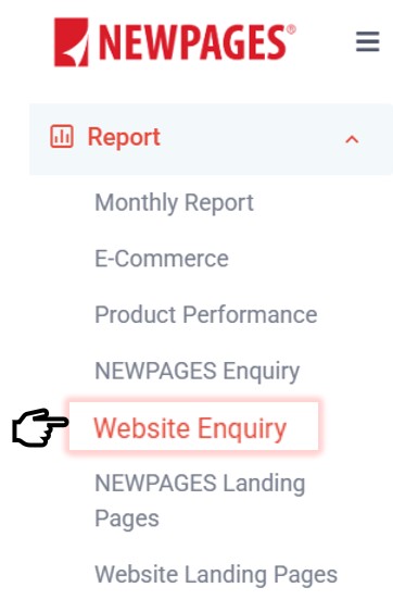
Where To Find Website Enquiry?
Via Menu > Report > Website Enquiry
Website Enquiry Report

This is where you can check your Website Enquiry Report.
-
The chart shows the number of website enquiries you received each month over the last 12 months.
-
The Current Month box shows how many enquiries you’ve received so far this month.
-
The Lifetime total shows the overall number of enquiries your website has received since it started running.
For example, if the current month shows 131, it means your website has received 131 enquiries this month. This helps you track how your enquiries are growing month by month.
Enquiry Details
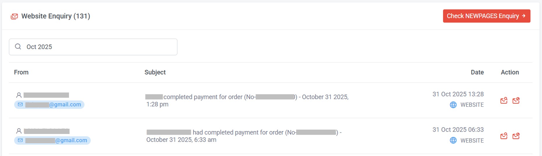
You can click on each enquiry to see the details.